The Jersey Doesn't Lie: What Separates the Legends from the Laundry
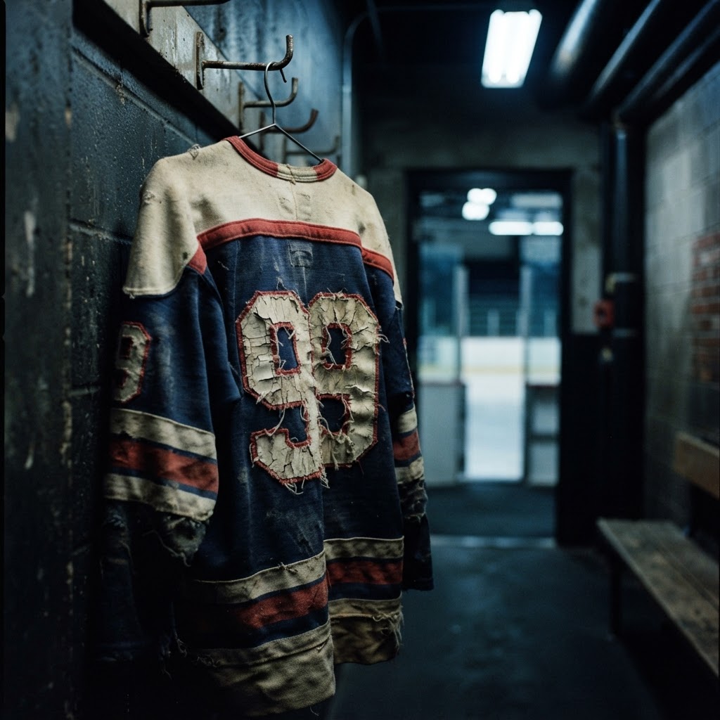
There's a jersey hanging in a bar somewhere in your city. You know the one. Faded numbers, cracked crest, maybe a repair job that made things worse. Nobody takes it down. Nobody moves it. It just stays there, holding court above the taps like it earned the right.
That jersey isn't special because of the thread count. It's not special because of the player whose name is on the back, though that helps. It's special because it absorbed something — a season, a moment, a collective feeling that a whole fanbase had at the same time. You can't manufacture that. You can't brief a design team on it. It either happens or it doesn't.
Most jerseys are just laundry. A few become legends. The difference is worth understanding.
The Crest Has to Mean Something Before the Jersey Can
Every great jersey starts with a logo that already carries weight. The Canadiens' CH has been on centerstones of hockey mythology for over a century. The Bruins' spoked-B is almost aggressively simple. The old Hartford Whalers' mark — the H hiding inside a whale tail, green and navy and completely unafraid to be weird — might be the most beloved crest of a franchise that doesn't even exist anymore.
Notice the pattern. The logos that endure aren't the ones that tried hardest. They're the ones that committed to an identity and didn't flinch. Hartford didn't apologize for being a small market with a strange mascot. They leaned in. Decades after the franchise relocated to Carolina, people are still buying Whalers gear like they're honoring a religion. That's not nostalgia. That's what happens when a design tells the truth about who it was.
Contrast that with the late-90s era of hockey jerseys — the 'third jersey' arms race where teams started throwing lightning bolts and claw marks and gradient fills at everything. Most of those jerseys are remembered as cautionary tales now. Not because the execution was necessarily bad, but because they were designed to sell merchandise instead of represent a city. The audience knew. They always know.
Color Is a Commitment, Not a Choice
The Vancouver Canucks have had something like seven distinct uniform eras. Ask a Canucks fan which one they actually love and there's a decent chance they say the 70s V-jerseys — the black and gold diagonal stripe that looks like it belongs on a muscle car. It never won a Cup. The teams that wore it were inconsistent. None of that matters. The color and the shape had conviction.
There's something to the way certain color combinations own their arenas. The Detroit Red Wings' red-and-white is so clean, so committed, that it reads as authority before a puck drops. Philadelphia's orange comes at you like an argument. Montreal's red-blue-white tricolor is basically the Quebec flag arguing with the Canadian flag and somehow winning both fights simultaneously.
Color in hockey jerseys isn't decoration. It's declaration. When the Pittsburgh Penguins briefly went to a Vegas gold in the early 2000s, it felt like a betrayal — not of aesthetics, but of identity. The classic black and gold they returned to wasn't just prettier. It was more honest about what Pittsburgh is.
The Jerseys That Carried the Weight of History
Some jerseys don't become legendary on their own terms. They get drafted into history.
The Team Canada red from the 1972 Summit Series is a simple jersey. White letters on red, a maple leaf, nothing fancy. But Paul Henderson scored that goal in it, and now that jersey is basically a Canadian sacred artifact. You could print the same design today on new fabric and it would feel like a replica of something holy. The design didn't change. What happened inside it changed everything.
Same logic applies to the Soviet CCCP jerseys from the same series — red and white, brutally minimal, almost geometric in their refusal of excess. Those jerseys represented an entire political and cultural machine, and they looked the part. Serious. Efficient. Completely without sentiment. You look at old footage of that series and the two jerseys together tell the whole story before anyone even takes a faceoff.
Then there's the way certain franchise moments become inseparable from the uniform worn during them. The 1980 US Olympic team's white jerseys are permanently attached to the Miracle on Ice. The jerseys weren't exceptional. The moment made them immortal. Hockey has a long history of this — the uniform absorbs the achievement and carries it forward.
Why Thirds Became the Truest Test of a Design Team
For a long time, hockey was a home jersey and an away jersey situation. Clean, functional, defined by the rules of the road. Then the alternate jersey — the third — changed everything, for better and for worse.
The third jersey gave teams permission to take risks. Some of them used that permission brilliantly. The Anaheim Ducks' early wild duck mask jersey is garish in exactly the right way for a franchise that started as a Disney property. The old Colorado Avalanche burgundy alternates felt like the mountains they were named after. The Buffalo Sabres' Goathead jersey — that polarizing 90s design with the charging goat crest — is now beloved precisely because it was too weird to be ignored.
Others used the third jersey as a revenue mechanism with no creative backbone, and those jerseys sit in discount bins at arena gift shops, unloved and unsold.
The thirds that work are the ones that say something the main jersey can't quite express. They're the b-sides that turn out to be better than the single. When a team gets a third jersey right, it often starts outselling the home jersey — not because of marketing, but because the design tapped into something true about the franchise that the official look had been repressing.
Numbers and Names: The Typography Nobody Talks About
Here's a thing that almost nobody discusses but every serious jersey person feels: the font matters enormously.
The Montreal Canadiens' block lettering has been essentially unchanged for decades. It reads like an institution. The Philadelphia Flyers' italic font leans forward, aggressive, like it's already in a scrap before the whistle blows. The old Quebec Nordiques used a rounded, almost friendly font that somehow matched the fleur-de-lis and the royal blue — a design that looked like it belonged in a place with strong opinions about culture and coffee.
When teams go to custom fonts, they're making a statement about permanence. When they go to generic block letters, they're deferring. The great jerseys know what they're doing typographically, even when the people wearing them don't know why it feels right.
Number placement, sleeve stripes, fight strap visibility — these are the details that separate a jersey that photographs well from a jersey that looks correct in person, under arena light, while someone is actually playing in it. The best hockey jersey designs were always built for motion, not for hangers.
What Makes You Keep a Jersey for Thirty Years
At some point, the academic analysis of design stops mattering. You either keep the jersey or you don't.
The ones that survive decades in closets and get handed down to kids and grandkids and end up on bar walls aren't always the ones with the best design credentials. Sometimes they survive because of what you were doing the first time you wore one. Sometimes they survive because your team was terrible and you loved them anyway, and the jersey is proof of that loyalty.
But the best jerseys — the actual legends — earn their place twice. First through the design, which has to be honest enough to stand on its own. Then through the life lived in and around them, which no design team can plan for.
A jersey becomes legendary when the design was good enough to hold whatever memories got poured into it. Like a good building that outlasts its original tenants. Like a good bar that becomes the neighborhood regardless of who's running it.
The fabric doesn't lie. The crest doesn't lie. You can tell, pretty much immediately, whether a jersey was made to last or made to sell. The ones made to last have a way of finding the stories they deserve.
That jersey in the bar? It earned its spot. The right design always does.
From the Collection
If you're the type who notices the font on a hockey jersey, the Hard Around collection was made for you. Shop now at /product/472301797.
Explore the drop →